[Top][All Lists]
[Date Prev][Date Next][Thread Prev][Thread Next][Date Index][Thread Index]
Re: small staff massacre
|
From: |
Werner LEMBERG |
|
Subject: |
Re: small staff massacre |
|
Date: |
Sun, 25 Jan 2004 04:01:46 +0100 (CET) |
[CVS 2004-01-22 10:01]
> > % . There should be a mechanism to give the staff size in a \with
> > % {...} block with a single command, covering all parameters.
> > % Perhaps a new `set-staff-size' scheme function?
>
> Possibly - I don't consider this high priority.
I agree. If two commands yield the expected results I can live with
it -- currently :-)
> > % 1. Note positions in chords are not computed correctly. There
> > % seems to be a problem to decide which is `up' and which is
> > % `down'.
>
> Strange, cannot duplicate.
I still get this. I use guile 1.6.4, compiled manually. For both
lilypond and guile I've used gcc 2.95.3 (with libc.so.6). Maybe a
rounding problem, relying on compiler-specific features?
> > % 3. The parameters to `extra-offset' aren't scaled properly.
>
> This is intentional. Extra-offset is a global mechanism that is
> supposed to work for arbitrary objects.
>
> We could change this, though.
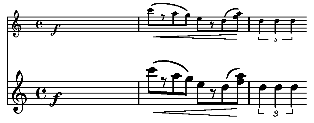
While extra-offset now seems to give the correct results, the size of
dynamics is still different (see image).
> > % 10. I'm not sure whether the thickness of staff lines really
> > % should be the same in both the bigger and the smaller staff.
> > % Thicker than normal is correct, but that thick? The problem
> > % is that the thickness of beams must be smaller; this reduces
> > % the contrast between beams and staff lines.
>
> Check out a good quality pocket score.
Hmm, I've just had a look into a Henle Urtext edition (violin concerto
No. 3 from Saint-Saëns, piano score), and there the staff lines of the
smaller violin staff *are* thinner. But this is from 2002, and it
looks like a computer generated score. An older Henle Urtext edition
(Beethoven violin sonatas, from 1978) indeed have equally thick staff
lines, but beams are thicker. So I suggest to increase the beam
thickness slightly or to reduce the line thickness a bit. [Some hours
later] After I've printed some pages with a 600dpi laser printer I now
think that thinner lines is the right solution.
Werner
small staff massacre, Han-Wen Nienhuys, 2004/01/21