[Date Prev][Date Next][Thread Prev][Thread Next][Date Index][Thread Index]
[ft] With Freetype 2.8 my desktop looks bad
|
From: |
Sebastian Lisken |
|
Subject: |
[ft] With Freetype 2.8 my desktop looks bad |
|
Date: |
Fri, 19 May 2017 22:17:20 +0200 |
|
User-agent: |
Mozilla/5.0 (X11; Linux x86_64; rv:52.0) Gecko/20100101 Thunderbird/52.1.1 |
Hi,
this is a user question, not about development, so if I’m asking in the
wrong place I apologise and would be grateful to know where else I
should take this.
I’m using Arch with GNOME 3 on an old-ish laptop, 1280×800 pixel screen.
Out of a feeling of necessity I spent some time making my own font
choices and have been very happy with the result. Using the Tweak Tool I
have set the fonts for window titles, interface, and documents all to
Droid Sans Regular, 10 (unit unknown, in a Firefox window I must use
Droid Sans, 11pt for the same size). The font comes from the ttf-droid
package (version 20121017-5). In my fonts.conf I have set the properties
hinting, autohint and antialias to true, hintstyle to hintslight, rgba
to rgb, lcdfilter to lcddefault.
My issue is that the recent update of the freetype2 package to version
2.8 has noticeably changed the way my fonts look. Vaguely it all appears
less crisp than before, but what is most disturbing is that in Droid
Sans Regular 10 there is now a striking imbalance between the non-bold
and bold version. This is particularly relevant in Thunderbird which
uses the “interface” font to display its trees or lists of mail folders
and emails. As soon as a mail folder contains an unread email, the name
of the folder is displayed in bold.
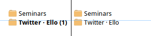
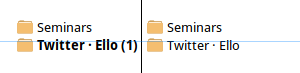
I am attaching two screenshots, one for freetype2 version 2.7.1 and one
for version 2.8. Both these screenshots show a small part of my folder
tree in two states, first with one unread email in the “Twitter · Ello”
folder and second with everything read. I have separated the two states
with a black vertical line, and I have added a partly transparent blue
horizontal line through the top of the letter T (non-bold state) as a
guide. As you can see, in freetype2 2.8 the font grows one pixel higher
in the bold state. I can assure you that it makes a large tree of mail
folders with some unread messages look quite uneven. It took me a while
to realise why the effect was unsettling, then I tried to ignore it for
a while, but that was impossible, Now I’ve downgraded to version 2.7.1
but of course I can’t go on with an old version forever.
I did try changing the font size and have noticed that only size 10
shows this strong difference. Very bad luck – given my screen
dimensions, size 11 does not give me enough content but 9 really is too
small. Also I don’t want to change to another font. Ideally I would like
to somehow configure freetype or X to behave much like it did before. Is
that possible?
Any help you can give would be much appreciated.
Sebastian
 droid-sans-10-freetype27.png
Description: PNG image
droid-sans-10-freetype28.png
Description: PNG image
- [ft] With Freetype 2.8 my desktop looks bad,
Sebastian Lisken <=