[Date Prev][Date Next][Thread Prev][Thread Next][Date Index][Thread Index]
[Synaptic-devel] Fwd: Status Icons difficult to read (screenshot)
|
From: |
Donald Mickunas |
|
Subject: |
[Synaptic-devel] Fwd: Status Icons difficult to read (screenshot) |
|
Date: |
Sat, 17 Aug 2019 15:26:25 -0400 |
|
User-agent: |
Cyrus-JMAP/3.1.6-869-g2d94aad-fmstable-20190814v1 |
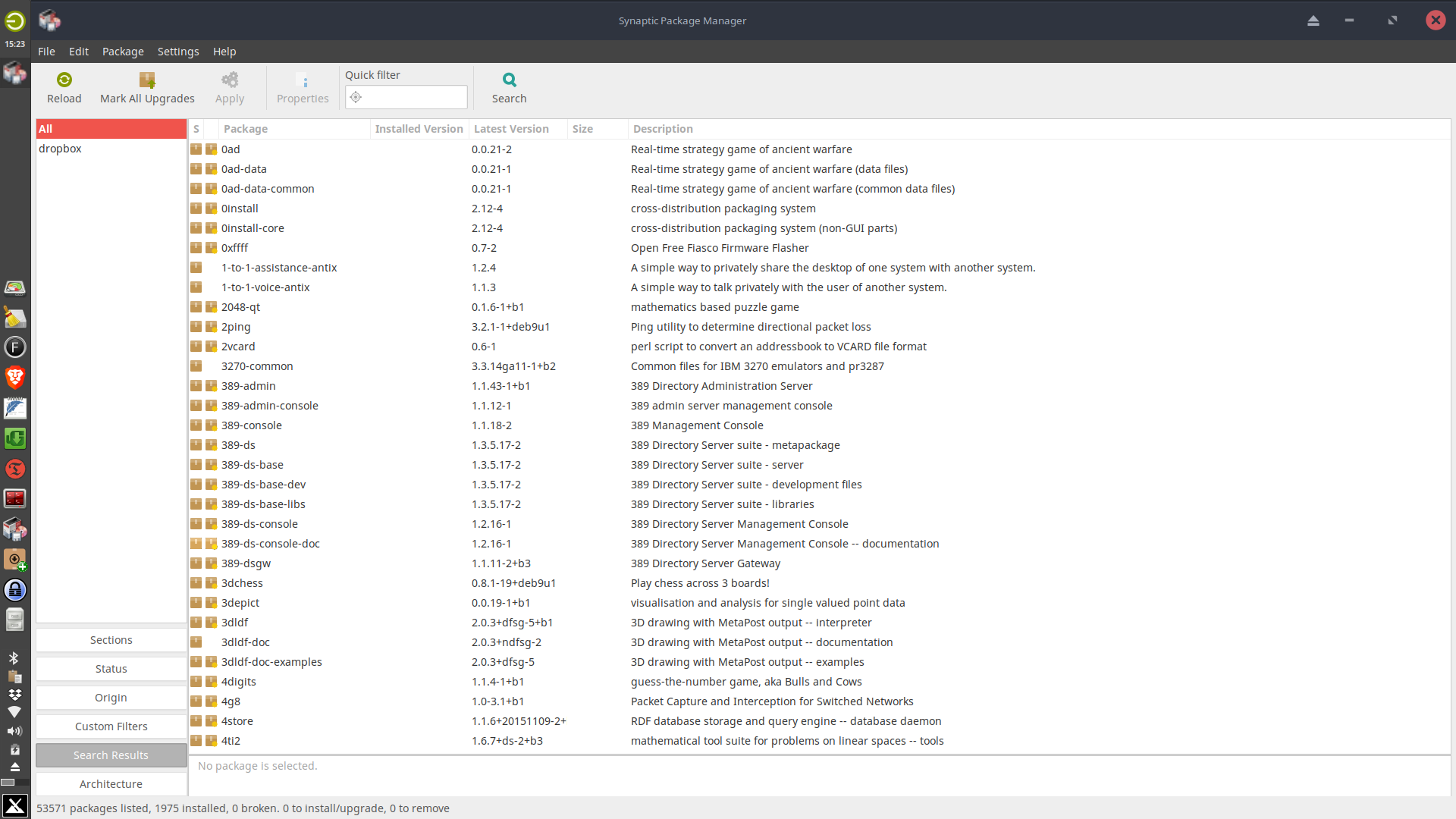
here is a screenshot of what I am seeing. I thought it would help
----- Original message -----
From: Donald Mickunas <address@hidden>
To: address@hidden
Subject: Status Icons difficult to read
Date: Saturday, August 17, 2019 3:03 PM
I am using the current version of MX Linux with the xfce desktop. I have happily used synaptic on various distros for years. However, I am unable to easily discern what the icons mean in the status column on your display. They are small, all are orange with only a small difference to indicate the status changes, which to my 64 year old eyes, is difficult to see. If you wish to use Icons, how about using a combination that offers more contrast? Larger icons would help too. Someone also suggested that the issue is from switching from gtk2 to gtk3. I wouldn't know but I do find the situation frustrating and would appreciate a solution soon.
Thanks for an awesome tool.
Don Mickunas
 Screenshot.png
Description: PNG image
| [Prev in Thread] |
Current Thread |
[Next in Thread] |
- [Synaptic-devel] Fwd: Status Icons difficult to read (screenshot),
Donald Mickunas <=