So what is the opinion of the pspp art director and what does the ui team think?
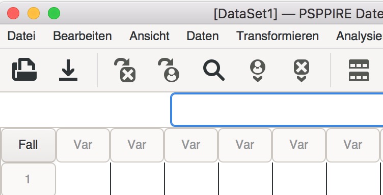
This is the look on MacOS with default icons „document-open“, „document-save“ and „edit-find“:

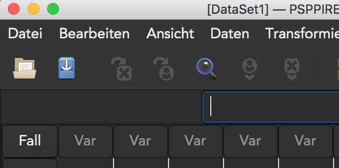
And here is the look with „document-open-symbolic“, „document-save-symbolic“ and „edit-find-symbolic“:
Here the „dark“ default
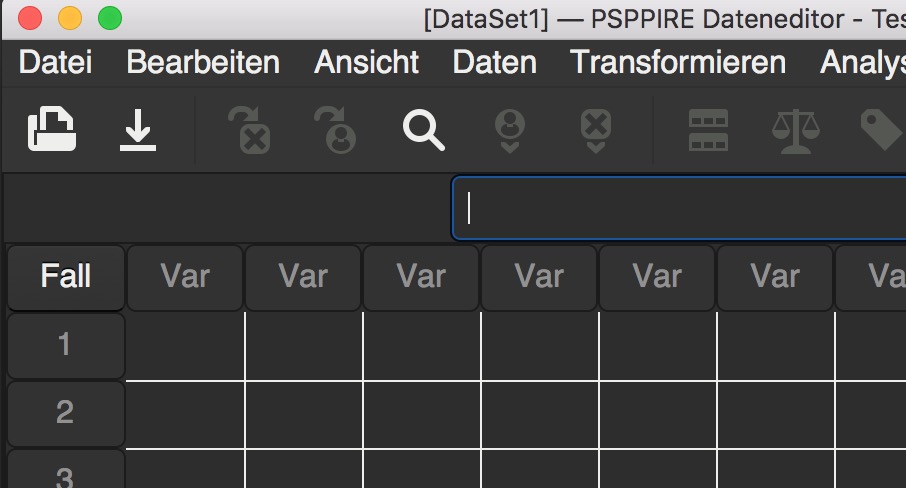
And here „dark“ symbolic version.
Am 05.07.2020 um 12:40 schrieb opensuse.lietuviu.kalba <opensuse.lietuviu.kalba@gmail.com>:
This is not feature request. This is bug about inconsistency in toolbar (not about icon itself): PSPPIRE have hardcoded all icon in sources (including one icon for find function), but (un)intentionally use one generic icon (desktop theme icon) for find function instead of hardcoded icon.