[Top][All Lists]
[Date Prev][Date Next][Thread Prev][Thread Next][Date Index][Thread Index]
Re: [ft] rendering changes 2.1.10 -> 2.2.1
|
From: |
Gordon Messmer |
|
Subject: |
Re: [ft] rendering changes 2.1.10 -> 2.2.1 |
|
Date: |
Thu, 16 Nov 2006 08:33:27 -0800 |
|
User-agent: |
Thunderbird 1.5.0.7 (X11/20060913) |
David Turner wrote:
There are indeed differences in the auto-hinter between various
FreeType releases, since we try to enhance it incrementally (and
this will be true for the next release, by the way, which should
treat serif fonts much better, try the CVS if you want).
I'll give that a shot soon.
I fail to see exactly what the problem is; you're not even providing
screenshots nor telling what is wrong, only that things are "different".
OK, I didn't describe the problem, as I perceive it, until the end.
"where Medium hinting used to provide very pleasing results, it
now seems to squish characters vertically, and they're fuzzy"
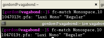
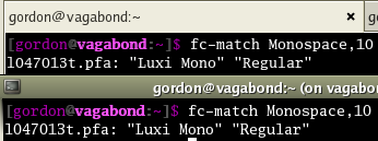
I've included a set of screenshot selections showing the Gnome terminal
using Courier and Luxi Mono. In each shot, the upper terminal is using
freetype 2.2.1, and the lower one is using 2.1.10. In the "best
contrast" shots, both appear identical.
In Courier-12-BestShapes, the fonts in the upper terminal look fuzzy.
Magnify the word "Monospace" in the image. You can see clearly in the
'M', 'n' and 'p' characters in the lower terminal have good, solid
vertical stems. They're one pixel wide and relatively solid in color.
In the upper terminal, those characters have two-pixel wide stems that
fade into the black background. This difference makes them appear very
fuzzy. All of the characters in the upper terminal appear fuzzy,
regardless of whether or not they have vertical lines. The old
rendering model did a better job, here, with medium hinting.
In LuxiMono-10-BestShapes, the fonts in the upper terminal appear fuzzy,
again. Vertical stems tend to be more faded in color, where they used
to be bright. The 'g' character also looks vertically squished where it
used to have a well rounded shape.
I can provide more shots, with different fonts, if you'd like. In
general, though, all of the fonts that I look at appear to look better
with medium hinting in 2.1.10.
Is there an easier way to test various hinting levels? I don't see
options within ftview to do anything other than turn hinting on or off...
Thanks for looking at this.


