[Top][All Lists]
[Date Prev][Date Next][Thread Prev][Thread Next][Date Index][Thread Index]
Re: [Directory-discuss] Help with testing, please
|
From: |
Karl Berry |
|
Subject: |
Re: [Directory-discuss] Help with testing, please |
|
Date: |
Fri, 5 Aug 2011 17:49:44 GMT |
Hi Josh,
* You can log-into <http://directory-dev.fsf.org>
Great to see this coming back into action.
when you log-in, if you do not have administrative
credentials, please email me <mailto:address@hidden>
I don't see any "edit" or similar tab at, e.g.,
http://directory-dev.fsf.org/wiki/3DLDF or
http://directory-dev.fsf.org/wiki/Free_Software_Directory:Bugs, unless
I'm just being blind (quite possible). Not sure what I should be
seeing. FSF username kberry.
Comments in addition to the existing bugs list. Let me know when you're
ready to seriously examine the top-level category list and I can try to
review.
- should the directory pages be licensed under CC-BY-ND now? Or
dual-licensed? Although I guess they are documentation in one way,
hence GFDL, it seems odd for them to be incompatible with the normal web
pages, which usually have more or less the same information.
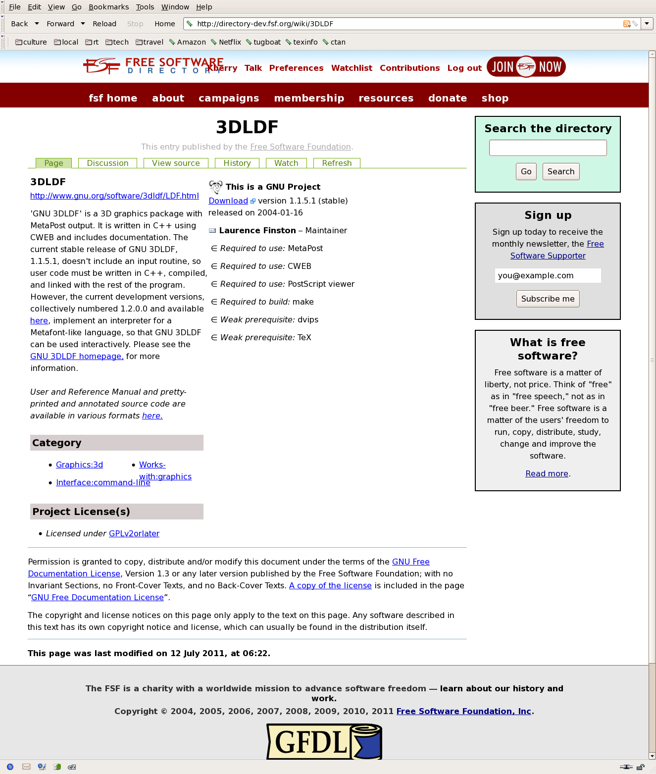
- for me, the formatting of the package pages is also rather suboptimal.
Screenshot of 3DLDF for me attached.
. The second column (starting "This is a GNU project") appears to be
nearly equal in width to the first, but it's just a list, while the
first column has running text, so IMHO deserves to be wider.
. A lot of space is left unused to the right of the second column (or
maybe that is just the second column having an excess width.)
. Overlapping text in the Category area. I'd suggest just a simple
one-column list.
. Personally, I wish it wouldn't arbitrarily decrease my chosen font
size. But aside from that, it seems wrong that the actual content
of the page is in a smaller font than the boilerplate boxes on
the right ("Search the directory", "Sign up", "What is fs").
. The use of the subset sign for the list of dependencies seems
distracting to me. Why not just bullets as usual? Or no marker at
all; the labels ("Required to use", etc.) seems sufficient.
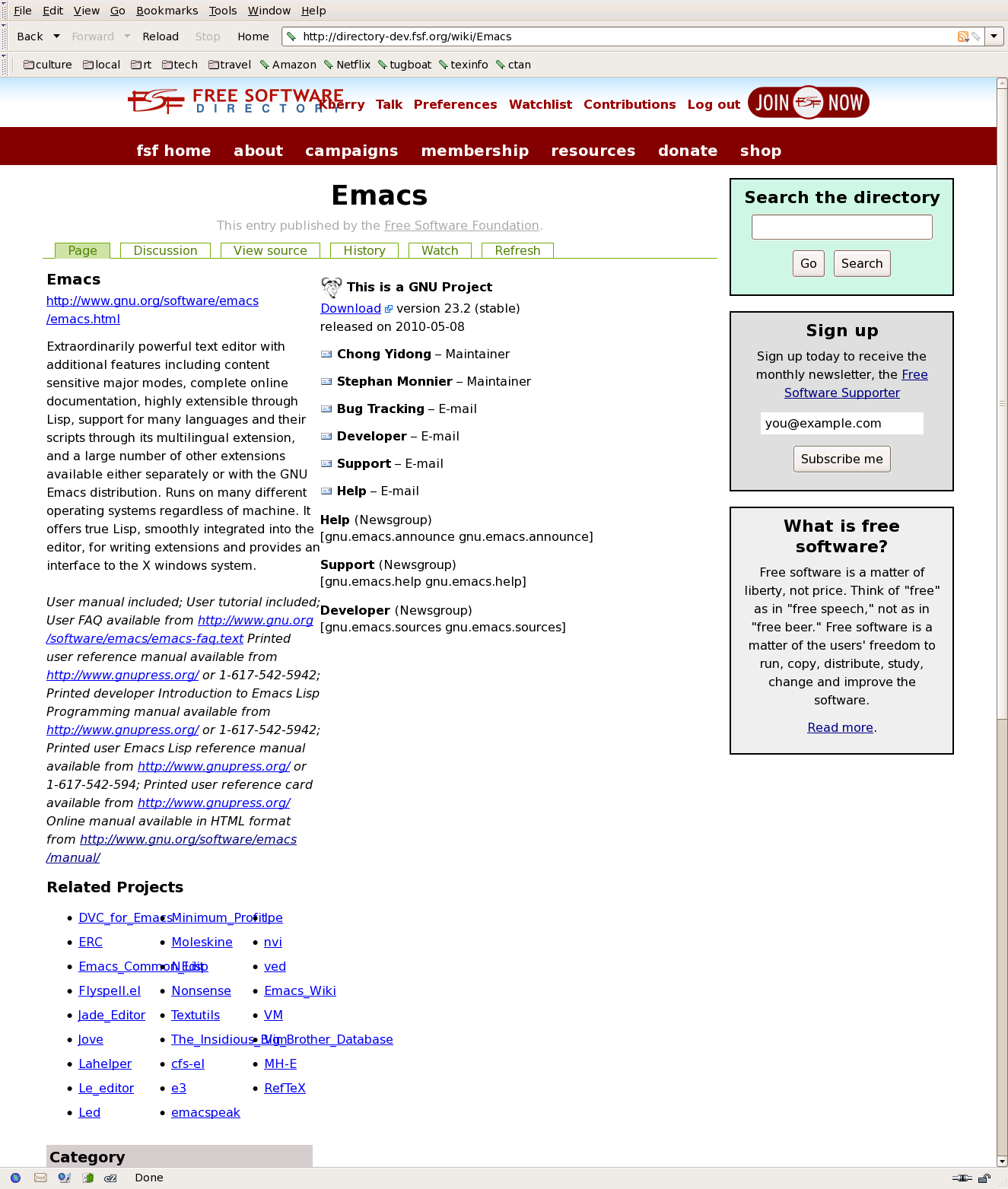
- Looking at the emacs page (another screenshot attached), more problems
appear:
. The "Related Projects" is missing its gray background.
. The overlapping is even worse.
. There is no gutter between the first and second columns.
. The documentation text all runs together, become quite a mess.
- How about making the doc text be another area, formatted like
"Category" and so on, with the regular font? Having it all be in
italics seems weird.
- If there is a standardized documentation url in the schema,
I suggest including it in some standardized way, perhaps below the
"Download" sentence in the second column.
FWIW, I found documentation urls for all GNU packages when I was
working on constructing http://www.gnu.org/manual/manual.html. If they
are of possible value for importing, I can send along.
- Finally, and perhaps most importantly ... what about the data dump?
Thanks,
Karl