Description: PNG image
|
| From: | Robin Bannister |
| Subject: | Re: Microtonal Helmholtz-Ellis notation in Lilypond: fine-tuning |
| Date: | Sat, 26 Sep 2009 22:33:56 +0200 |
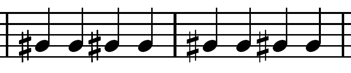
Well, erm, how far do we want to get into fine-tuning? OK, it looks like you only want one glyph at a time. Torsten wanted several; he used markup to declare them in a group. And to keep a group looking cohesive he wanted more spacing on the left. The interval-translate hack killed two birds with one stone: - put the group closer to its note - effectively padded it on the left. But if you want less (or no) padding on the left, try this instead: \override Accidental #'X-extent = #(lambda (grob)cis cis cis cis | % the sharp sign is too much left!gis' gis gis gis | % the note and the sharp sign are too much right!
   (let ((iv (ly:stencil-extent (ly:text-interface::print grob) X)))
     (cons (- (interval-start iv) 0.1) (- (interval-end iv) 0.7))))
It lets you adjust left (0.1) and right (0.7) separately.
I don't want to get involved in more detailed fine-tuning,
but I did try out a test case based on your gis measure:
juxtapose feta and HE and then get them to match (see feta_HE.png).
That is how I arrived at the values above.
But of course that is just for the sharp sign ...
And before I could start measuring the two sets of spacing,
I found I had to shrink the HE sharp to make it comparable!
\override Accidental #'font-size = #-1
Cheers,
Robin
![]() feta_HE.png
feta_HE.png
Description: PNG image
| [Prev in Thread] | Current Thread | [Next in Thread] |