[Top][All Lists]
[Date Prev][Date Next][Thread Prev][Thread Next][Date Index][Thread Index]
Re: percent repeat glyph
|
From: |
Neil Puttock |
|
Subject: |
Re: percent repeat glyph |
|
Date: |
Sat, 22 Nov 2008 01:17:27 +0000 |
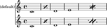
Hi Daniel,

2008/11/17 Daniel Hulme <address@hidden>:
> I have just got back from a band rehearsal, and tonight for the first
> time I could see what bothers me about Lilypond's percent glyph: the
> dots are too far out. I think they should be horizontally closer to the
> centre, so that the space between the dot and the oblique stroke is more
> like the space between the dot and the staff lines. As it is, the pointy
> whitespace between the dot and the corner of the stroke makes it look
> like the dots are vertically off-centre in the staff space.

I think the best option is to make the kerning settings tweakable.
In fact, there's a TODO in the source suggesting this.

I've just submitted a patch for review; attached is some sample output.

Regards,
Neil
 percent-kerning.png
Description: PNG image