On 12/22/09 12:45 AM, "Marc Hohl" <address@hidden> wrote:
Carl Sorensen schrieb:
On 12/21/09 1:52 PM, "Marc Hohl" <address@hidden> wrote:
[...]
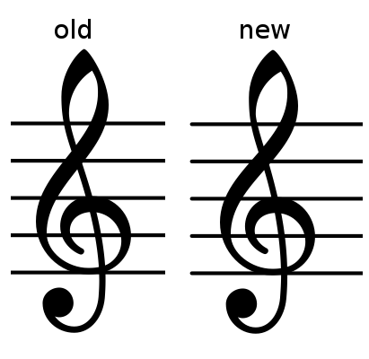
I like it much better.  But I think that the bulb on the bottom of the clef
needs to shift slightly to the right with this change.
Like the attached one?
You may use the pdf file for a printout.
This may be a bit too much different, or maybe it's just the change in the
curvature that bothers me a bit.  It feels like the curve at the bottom of
the clef is too pointed somehow.  Perhaps it's the transition that I'm
responding to; I'm not really sure.
Perhaps I overdid it a bit; here is a version where the bulb is exaclty
half-way between
the first and the second attempt.
Looks good to me.  I'd also like to see half-way between this attempt and
the first attempt, not because I think this is wrong, but because I tend to
find optimum settings by finding "not enough" and "too much" and going
between those two.