[Top][All Lists]
[Date Prev][Date Next][Thread Prev][Thread Next][Date Index][Thread Index]
[Gnumed-devel] An Analysis of Demographics - Comments RT
|
From: |
Richard Terry |
|
Subject: |
[Gnumed-devel] An Analysis of Demographics - Comments RT |
|
Date: |
Mon, 19 Jul 2004 14:36:40 +1000 |
|
User-agent: |
KMail/1.5.4 |
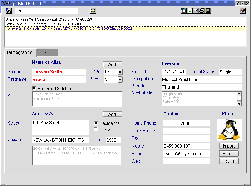
I've spent a couple of hours over lunch time playing/thinking with this:

=========================
DEMOGRAPHICS - BUGS AND COMMENTS
GENERAL COMMENTS
=========================
What we want to see here is a combination of functionality and logical screen
design, and I suspect given the differences in country we will need to trade
these two off to get a balance.

A quick few points.

======================
Use of Combo's phrase wheel mouse
======================

As a general rule, using drop down combo's are fine, however there are
dis-advantages to those who want to use a keyboard. For example take the
title combo. Yes you can 'cycle through this using the arrow keys, but it is
much quicker to do the following:
        -allow the combo's to be editable
        -pop up the phrase wheel as the user types
        -mouse oriented (or happy to jump from keyboard to mouse) can still use
the
mouse
        -at lost focus event the content of this must be validated against
acceptable
norms eg 1*2-*.5^& would be unacceptable as a title
The same goes to all combo's in this section.

=========================
Multiple occurrences/or none of patient(s)
=========================

The current solution of the modal popup box doesn't work well for the
following reason. Please, before you jump up and down about this give this
some consideration. Having been a linux user for some time (years) now, the
biggest single thing I notice about modal windows (not just in
gnuMed/wxPython etc) but in many programs - is that they are easily 'lost'
amongst the clutter of linux pop up windows. They sometimes pop up behind
where they are supposed to (I know they shouldn't but they do) and also, in
this case - the window is tiny - not an easily recognisable size, and the
columns of the grid are all crushed together.

Often when we have multiple names to select from in a popup box, we may need
ancillary information to make the selection, which may not be visible in
small popup box.

Also there are times we will want to search the patient database and pull up
all occurences (eg looking for a patient and know his name is John, but
nothing else.

There is an elegant and good looking solution to this within the bounds of our
current screen design, namely that (with re-organising the list containing
the grid of medicare/dva/whatever numbers) of adding a grid in the remaining
area of the screen - below the existing wigits(or above which would be my
preference ( see the QT screen dump that I knocked up many many moons ago
when we were first debating the subject).

In addition, the lack of functionality of this screen illustates the need for
the section-specific toolbar icons to be loaded into the bottom tool bar when
the section is selected. To see how this works just click on the manual tab
and notice the icons that appear. Not that I like these icons (I seem to
remember these were a few I snaffled from somewhere when I first mucked round
with the gui-design.

If those of you doing the backend have done the job properly, changing the
gui-around to the above specs shouldn't be that onerous

Also I would be keen to here from those of us in different countries about the
extent of differences on the clerical side of demographics - ie we have the
medicare number, dva number, health entitlement cards. Note in the original
QT mockup I included  a tab for clerical as a possible solution to this.

Commments Please.

=========
Specific Points
==========


All text boxes should be cleared at start of new patient search;
-this does not happen. This is imperative. There needs to be a subroutine
which loops through all controls and clears them prior to re-load
e.g:

-self.txt_preferred is not cleared so next patient has same salutation as the
last one
-self.cb_preferredname not reset
self.cb_addressresidence not reset
self.cb_addresspostal not reset

Surname         Changing spelling not possible (to database)
Firstname.      change spelling not possible (to database)
Title                   Changeing not possible (to database)
                        allows data junk input and numbers
Sex                     changing not possible (to database)
                        no data validation (eg allows numbers, ie need
restrction to M/F
                        this should be a read-only control


Street/Suburb display   Not sure what happened to this in the iterations, I
certainly didn't design it like this. The way the text boxes are displayed is
illogical                                       and misleading. I will
re-design the gui here.
Suburb                  this field should auto-capitalise
                                a phrase wheel should pop up with list of
suburbs matching screen
                                when auto-completed should automaticaly put in
corresponding postcode
                                user should not be able to put in unknown
postcode
                                tabbing off this field removes its contents
Postcode                        Allows input of numbers (is this needed in some
countries??)
                                Should allow per country config (e.g in AU
always have 4 numbers)
                                this field should not be user-inputted (auto
complete from Suburb

Addresstype             Looks shitty I will redesign-move-make better
                                The data is not saved to database anyway
-
Birthdate                       no validation on input (come on!!!!)
                                changes not saved to database

Occupation:     - not saved
                        - ?phase wheel doesn't pop up with auto-completion of
occupations from
table lu_occupations
                        - mmm... then again it does sometime - can someone
explain the source
                        - I bet lu_occupations doesn't learn the occupations
typed in by the user

combo_relationship              only filled with mother/father
                                        should be read only
                                        ideally I'd prefer a pop up phrase
wheel here (quicker) and elsewhere
there are combo's or have the combo automatch typing in
                                        which case it can't be read only but
then should auto-complete (quicker
and avoids keyboard - mouse shifts which are time
                        consuming.
Mitgliedsnummer - etc           I presume this is meant to be country specific
ID
numbers eg medicare, DVA etc.
                                                Needs label to this effect
                                                There is no current way or
re-editing mistakes, ie click on list should
load back to editing boxes
                                                What are the two side by side
boxes for ?are they something country
specific??
                                                LIst below this is much bigger
than needs to be

Photo's
-import/export don't seem to work
-Need to also aquire from digital camera (in rooms)


Next Of Kin
                        -Button doesn't activeate pop up search box to search
database for patient
                        relationship combo

Regards

Richard
 gnuMed_Patient_QT.png
Description: PNG image
- [Gnumed-devel] An Analysis of Demographics - Comments RT,
Richard Terry <=