Hello,
Recently I've been trying to adjust my application's use of FreeType so that the text rendering is as close as possible to that of Mac OS X's Core Text, which I find hits the best balance between sharpness and maintaining the intended shape of the glyphs.
For anyone interested, I've got it pretty close through a combination of:
- use of FreeType's light auto hinting mode
- using the default FIR filter (0x10, 0x40, 0x70, 0x40, 0x10)
- custom code in my application to draw the same glyph twice (on ontop of the other) as a means to thicken things up in the case of light text colours on dark backgrounds. I find that light (in terms of weight) fonts in particular appear rather faded under
FreeType, in comparison to Core Text, especially in the case of light text on a dark background. I've attached some examples at the end to illustrate the nice improvement this somewhat crude technique produces.
Anyway, the one thing that still stands out relates to the differences in hinting between FreeType and Core Text (actually, I'm not even sure if the latter does any hinting).
What I'm frequently finding is that the FreeType auto hinter hints well enough but in the process of doing so, reduces the height of the font by one pixel. Without really knowing how the hinting process works, I can see this makes sense if it is snapping
horizontal sections of glyphs to the line below because this is the nearer than the line above.
What is interesting though is that in the cases where this happens, a better and IMO more appropriate result can be obtained simply by asking FreeType to render at one pixel bigger (still with hinting turned on). In fact, the result then is almost identical
to what Core Text seems to be doing.
So my suggestion is could FreeType's auto hinter do something like this itself - e.g. if when working out all that clever latin blue zone stuff, could it realise that actually it's making the font smaller and a better result could be obtained by increasing
the requested pixel height and hinting at that height instead? Or make the hinter round up to the next line rather than round down, on the basis that rounding up is likely to result in more readable text?
I tried to write something in my application that scanned the bitmaps produced by the rasteriser to try and detect the height of the capital letters it had actually created and then re-render at one pixel higher if they were too small, but this didn't
seem to be reliable enough and it feels like something that needs to be analysed as part of the hinting.
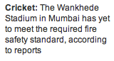
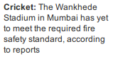
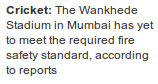
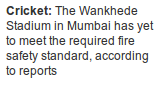
Anyway, I've attached some screenshots to better illustrate my point.
As you can see, number 4 is both sharp and of the requested height.
1. Core Text @ requested height
2. FreeType @ requested height (with no hinting)
3. FreeType @ requested height (with light hinting)
4. FreeType @ requested height + 1 (with light hinting)
5. Core Graphics - single drawn (observe the word 'Sport')
6. FreeType - word 'Sport' single drawn
7. FreeType - word 'Sport' double drawn
Anyway, thanks for reading :)
Cheers
Oliver.