[Top][All Lists]
[Date Prev][Date Next][Thread Prev][Thread Next][Date Index][Thread Index]
Re: [ft-devel] [Patch] CJK autofit/autohint blue zones
|
From: |
mpsuzuki |
|
Subject: |
Re: [ft-devel] [Patch] CJK autofit/autohint blue zones |
|
Date: |
Wed, 20 Apr 2011 15:16:27 +0900 |
Dear Sir,
Now I'm reviewing your patch to improve bluezones
for CJK Ideographs, and have 2 questions.
Q1) The vertical bluezones are essential?
In vertical CJK typography, there would be the requirement
to align long center stems (of the glyphs like "十", "土",
"王"), to pretend the centerlines of the glyphs are aligned.
However, I'm questionable if there is a requirement to align
non-center stems to be aligned. Maybe the alignment of the
vertical stems of the radical-"enclosure" glyphs (like "回",
"囚", "困") or radical-"gate" glyphs (like "門", "開", "閉" )
may improve the quality. But I'm questionable if there is
the requirement to align the left vertical stems of radical
"mound" glyphs (like "阿", "防", "阻"), or radical "mouse"
glyphs (like "叫", "叩", "叱").
Maybe my impression about vertical bluezone is based on the
typography in Japanese market, so, I don't think this is
generic. Please let me know if there is such requirement in
Chinese or Korean typography.
Q2) What kind of glyphs are good to calculate the fill bluezone?
It seems that the characters to calculate the top-fill bluezone
is collected from the characters which have some peak/apex in
upper boundary but have no horizontal strokes. Is it possible to
reduce the testing characters by using the characters with the
the radicals with peak, like, "京" (radical lid), "令" (radical
man), "安" (radical roof), "床" (radical dotted-cliff), "草"
(radical grass)?
In my personal opinion, using "dot beyond horizontal stroke" is
good benchmark to reserve the room of the dot in low resolution.
--
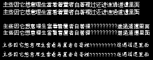
Also I attached the comparison of 3 typefaces.
>From top to bottom:
1) WQY ZenHei, version 0.6.26, 2008-Jun-25
2) IPA Gothic (Japanese), version 1.0, 2003
3) AR PL ZenKai Uni (Taiwanese), version 0.1, 2005-Aug-11
For each typeface, the upper is git 2011-Apr-13 without
your patch and the lower is git 2011-Apr-13 with your patch.
Some glyphs are clearly improved (進過道還), even in Kaishu
case. This is very good.
However, some strokes have inconstant line width issues;
the top horizontal stroke of "面" is typical example.
"看" in IPA Gothic shows similar issue.
I think your patch is very good but the list of testing
characters requires more discussion. So I will try to add
new API for the client to modify the list.
Regards,
mpsuzuki
 comparison-mps_20110420.png
Description: PNG image
- Re: [ft-devel] [Patch] CJK autofit/autohint blue zones,
mpsuzuki <=
- Re: [ft-devel] [Patch] CJK autofit/autohint blue zones, Werner LEMBERG, 2011/04/20
- Re: [ft-devel] [Patch] CJK autofit/autohint blue zones, suzuki toshiya, 2011/04/20
- Re: [ft-devel] [Patch] CJK autofit/autohint blue zones, mpsuzuki, 2011/04/20
- Re: [ft-devel] [Patch] CJK autofit/autohint blue zones, Just Fill Bugs, 2011/04/20
- Re: [ft-devel] [Patch] CJK autofit/autohint blue zones, Werner LEMBERG, 2011/04/20
- Re: [ft-devel] [Patch] CJK autofit/autohint blue zones, mpsuzuki, 2011/04/20
- Re: [ft-devel] [Patch] CJK autofit/autohint blue zones, Just Fill Bugs, 2011/04/21
- Re: [ft-devel] [Patch] CJK autofit/autohint blue zones, suzuki toshiya, 2011/04/21
- Re: [ft-devel] [Patch] CJK autofit/autohint blue zones, Just Fill Bugs, 2011/04/23
- Re: [ft-devel] [Patch] CJK autofit/autohint blue zones, Just Fill Bugs, 2011/04/23