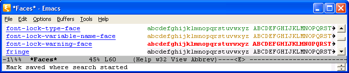
Date: Tue, 16 Jan 2007 18:30:07 +0100
From: Lennart Borgman <address@hidden>

`font-lock-warning-face' is bold. That makes it very hard to read, at
least on w32 with default fonts.
I find this face quite readable, in "emacs -Q". Did you perhaps change the default colors? If not, I cannot imagine how can this face be hard to read, it is IMO one of the most readable faces in Emacs.
I have not changed anything regarding this.
Here is how it looks at my display. Could be problem with the display driver though. But look at mn, W M.